Tuesday, January 25, 2011

Advertising Photography and its response to social and cultural context (Group)

With advertisement in relation to photography we have researched and learnt that in order to successfully accomplish the clients needs you need to adapt to what they are asking for in regards to the message they intend on getting across. This may result in capturing images that may not be to your personal photographic style. The image itself does not have to be aesthetically pleasing but has to get the message across to promote the business and have impact on the required target audience. The photographs context is of most importance and the subject matter shouldn’t always be so obvious as this will therefore promote a greater interest and prolonged memorable advertisement. The image must also work in harmony with a simplistic eye catching logo.

We also think that versatility is an important aspect of photography; within advertisement purposes, as you are pleasing someone else’s criteria.

A few examples of advertisement photography are below:

Toscani – Bennetton

Toscani on the other hand went against his client’s request for advertising Benneton. He came to interpret the Benetton company with controversy. Making it more personal to him. In result his work as an advertisement photographer plummeted. This is why you need to have a barrier in train of thought when coming up with ideas for the companies needs. In a way a set brief is set for a reason and keeping it relevant to the business requirements is of upmost importance.


Monday, January 24, 2011

The Process; Russell

When thinking of ideas for this group brief my main contribution was the location element to the photographs. It had already been decided that we would re-create famous artwork, my contribution to this was the idea of shooting in different locations. I thought of this after I had seen a set of photographs by Chinese photographer Ou Zhihang. He had taken a set of self-portraits in locations of topical significance. In the photographs he was naked doing press-ups. The set of photographs (below) received an 'honorable mention' in the World Press Photo 2010 awards.
This image is again an example of doing something that doesn't entirely match what your doing but draws peoples eye and so attracts attention hence making it relevant.

As a group we decided we would re-create 5 pieces of art. Those being The Thinker, The Mona Lisa, American Gothic, The Dancer and The Last Supper. The Thinker being the stand out one as this is a sculpture which represents Knowledge, One of the key things that Bloomberg as a company stands for.

I attended 3 photoshoots for this brief. Two as a photographer (The Thinker & American Gothic) and One as a model (The Last Supper). We decided to split the shoots and send each other, each others images and edit them to see who came up with the best ones.

Below is my shot; which I sent to the rest of the group, from The Thinker photoshoot.The model for this shoot was a man called Jon Walsh, a friend of Joannes. I decided to go for a tighter crop so to emphasize both the pose of the model and the model him self. I felt by doing this it would focus the viewers eyes on what is the focal point of the image. I liked my end product but both me and the rest of the group felt it wasn't bright enough for the brief.

This is my edit of the image including the logo.

My other shoot I was involved in was the American Gothic shoot (below).The models involved were, Joannes mum and a man known as 'Raving Pete' around Accrington. We saw Pete as an ideal man for this shoot due to his flamboyant dress sense. How he is dressed in this photograph is how he dresses normally.Above is my edit containing the Bloomberg Logo.


Above is my edit of the Last Supper shoot. This is a shoot I was invloved in. We decided dress in business wear so to reflect the corporate image of Bloomberg. I then added the logo to the image (below).


The final Image that I edited was a photograph which I was not involved in the shoot on. It was The Mona Lisa.


Using lightroom I cropped the top off this image so make the frame look more like the original painting; format wise. I think this was successful as it has helped to focus the attention on the subject.


This is my final edit of the Mona Lisa after I had added the logo.


Ideas Process (faye)

There were many ideas that came to mind within the group. here is the the input on my behalf.

Reason of choice
Within graphic design and advertisement I belive that to have a succesfull logo or advertisement must be recognizable, stand out and make an impact on the viewer..  take the cadburys advert for example, wasnt 100 % relevant to the brand as there main product is chocolate, but their intention with the gorilla advert was to apeal to a wider audiance and create more of an 'entertainment peice' through advertising. I think that the most important thing through advertisment is to not be so direct with getting the message across. To let the brain work on relating the advert to what you are advertising. The more the viewer has to think about the advert, the more likely it is to stick in their memory .

So we decided use the idea of re-creating iconic images through art. Yes it has been done before but in a way works in our favour, as people become more and more familair with them. just using it in a completely diffrent contex.

Here are the iconic images I used as an exapmle .

The Thinker : Is a bronze and marble sculpture by Auguste Rodin held in the Musee Rodin in paris. It depicts a man in sober meditaion battleing with a powerful internal struggle. It is often used to represent philosphy. 

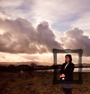
The initial thought behind using this for the bloomberg advertisement was to represent strength and knowlage. which is two aspects of what they offer to clients. 

the image below is the bloombetg interpretation of the thinker for advertisement purposes.

Image by Joanne Studholme


This was the outcome of the bloomberg interpretaion of the thinker. The window has been super imposed due to the writing on it, saying 'knowlage is power' as bloomberg tend to provide thier costomers with knowlage of business management. I have decreased the detail and blacked out the bottem of the image so that there was nothing interfiering with the bloomberg logo at the bottem and it stand out alot clearer, I also think that the window brings some bright and bold colours into the advert which works wel with another of bloombergs aspects. I have provided the original Bloomberg logo for recognition purposes and have chosen the bright orange color so that it stands out and catches the viewers eye. I have darkened each image at the bottom with a vignette so there is no confusion or interfirance with the logo. The only element of disatisfaction with this image is the redness and shadows on the modles face. Finished advertisement and original logo below.


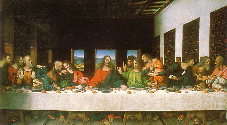
Another idea was to Re- create the famous and iconic painting 'The Last Supper' by Leonardo da Vinci . My main inspiration for this idea was the photography work of David Lachepelle he had interperated a more contempary version of  'The Last Supper' through photography


 So I thought why not interpret a more corprate version. There are also certain symbols of this painting which can realte to what Bloomberg stand has to offer, such a guidance, support, trust, and sharing knowledge. Here is another example of this this iconic image being used for fashion advertisment purposes by the Girbaud Fashion house. It isnt an exact replica but you can tell they have used 'The last supper as their main inspiration.  


Below is the Bloomberg version of 'The Last Supper' for advertising purposes before the logo.

Photography by Donna Cradock. 


And another with the Bloomberg logo. I decided to edit the picture as close to the painting as i could with the knowlage i have of Photoshop and Lightroom. I managed to use a fliter on Photoshop to give a slight grainy look to represent a painting feel. My involvement with this photography shoot was the art direction. I got an image of the original Last Supper and tried my hardest to get it as close as possible. bareing in mind we were short one person. 


Another image we replicated was the Mona Lisa (below, idea credited to donna Cradock.) Again with the editing process i tried to make it look like the original painting. To me the mona lisa stands for power, strength. The painting is known to have a presence and again make an impact on her audience when viewing, in relation to Bloomberg making an impact on their clients who seek help. 


I have used a preset that gives this effect (below) in Lightroom to match the greenish cast on the Mona Lisa painting. I increased the exposure on my face with the brush tool in Lighroom and edited my lip peircing out for the more cop-rate finish.  

  
Photography by Donna cradock.


The only thing I would change about this image is to increase expose with the brush tool on my hands a little bit more. 


Another iconic art piece that we have reinterpreted is The American Gothic. The edited image is below. 

Photography by Joanne Studholme. 

I did consider this photograph in black and white but decided to keep a color theme through out  the editing process and enhance the color  slightly. I though this was relevant to Bloomberg representing boldness. 


As you can see this is the the finished advertisement based on The American Gothic I have kept the logo to the bottom of the image where the information is less relevant, also with the logo being at the of the bottom of the image, I felt like it needed to be a bit bigger to stand out. I have carried out this theme through out the advertisements.


Aditional ideas .

Here are a few of the additional ideas and examples of using iconic images through advertisement. 


The Fleet Foxes have used this iconic painting called the Netherlandish Proverbs (also called the The Blue Cloak or The Topsy turvy World) for their album cover. 


The Guinness advert


Guinness is another company whose advertisement has been influenced by iconic art.
below is the one of two oil paintings of the Tower of Bable by Pieter Bruegel ( the other showing more of the construction) 
Guinness have used this in an advert which i have screen shotted below. See the relation to the screen shot and the Pieter Bruegel painting.


Final Images


The Dancer by Edgar Degas (Donna)


"La Petite Danseuse de Quatorze Ans" ("Little Dancer of Fourteen Years"), c. 1881, is a sculpture by Edgar Degas of a young dance student named Marie van Goethem. The sculpture was originally made in wax before it was cast in 1922 in bronze.
"Little Dancer of Fourteen Years old" is made from wax, an unusual choice of material for a sculpture of this time, dressed in a cotton skirt with a hair ribbon, sitting on a wooden base.
When the "La Petite Danseuse de Quatorze Ans" was shown in Paris at the Sixth Impressionist Exhibition of 1881, it received mixed reviews. The majority of critics were shocked by the piece. They thought it was ugly, that it looked like a medical specimen, in part because Degas exhibited it inside a glass case. Some considered the head and face grotesque and primitive.
His heirs (wife and daughter) made the decision to have 27 of them cast in bronze. The casting went on at the Hébrard foundry in Paris from 1920 until the mid-20th Century, producing the posthumous Degas bronzes that can be seen in many museums. Sixty-nine original sculptures in wax and mixed-media survived the casting process.
One copy of "La Petite Danseuse de Quatorze Ans" is currently owned by the creator and owner of Auto Trader, John Madejski. He stated that he bought the sculpture by accident. John Madejski's was sold for 13,257,250 £ ($ 19,077,250) at Sotheby's on February, 3rd 2009.
To make this little dancer, Degas used a skeleton made out of paintbrushes. In the end for a finishing touch he used a wig out of real hair to put on the model. He then covered it with wax. The only part of the original sculpture not covered with wax was a ribbon given to him from the model, Marie van Goethem, and a real tutu. Each museum that shows this figure gives it a different tutu.
The original wax model was acquired by Paul Mellon in 1956. Beginning in 1985, Mr and Mrs Mellon gave the US National Gallery of Art 49 Degas waxes, 10 bronzes and 2 plasters, the largest group of original Degas sculptures, among them this sculpture.

Our Interpretation


Because the brief covered humanity as a whole, we decided, as all of our other ideas feature adults, it would be a good idea to have one that represented a child, as Bloomberg provide financial services for all aspects of life.  The Dancer stood out to us as things like extracurricular activities (such as ballet!) can be expensive, and are part and parcel of being a parent and managing your money.

I asked my daughter Mia to wear her old ballet leotard and tutu, and to recreate the pose as closely as possible.  The image was taken in front of my garden hedge to provide a fairly neutral background that has a bit of visual interest.


This is the contact sheet showing the images I took on the day.

This is the final image (left), compared to the OOC photograph (right)


I decided to tone the image with dark yellows to give it a vintage feel and also to hint towards the look of the cast bronze statue.  Apart from this, and a few minor bits of cloning out of the marks on the floor, the image is relatively untouched.  I'm pleased with the way it turned out too, its obvious what it is emulating and the editing compliments it well.


Friday, January 21, 2011

Donnas Edits

For 'American Gothic' I decided to edit the photograph as closely as possible to the tones of the original image, so i gave it a slight vintage touch and lightened it up a little.  I think this image and edit is really effective, I'm really pleased with how it turned out and how Jo captured the scene.
For 'The Thinker' I attempted to replace the window in the back with a photograph Jo had taken of a stained glass window, and considering my limited photoshop abilities I dont think it looks too bad.  I converted it to black and white as well to give a feeling of the carved statue.  Definitely my weakest edit though, I'm happy this one wasnt chosen as a final edit!

The Last Supper by Leonardo Da Vinci (Donna)


The Last Supper (Italian: Il Cenacolo or L'Ultima Cena) is a 15th century mural painting in Milan created by Leonardo da Vinci for his patron Duke Ludovico Sforza and his duchess Beatrice d'Este. It represents the scene of The Last Supper from the final days of Jesus as narrated in the Gospel of John 13:21, when Jesus announces that one of his Twelve Apostles would betray him.
Leonardo da Vinci painted The Last Supper on a dry wall rather than on wet plaster, so it is not a true fresco. Because a fresco cannot be modified as the artist works, Leonardo instead chose to seal the stone wall with a layer of pitch, gesso and mastic, then paint onto the sealing layer with tempera. Because of the method used, the piece began to deteriorate a few years after Leonardo finished it.
Two early copies of The Last Supper are known to exist, presumably the work of Leonardo's assistant. The copies are almost the size of the original, and have survived with a wealth of original detail still intact.

Our Interpretation

As we wanted to include different slices of life in our interpretation of the brief, we decided to re-create the last supper but in terms of a business meeting.  It was quite difficult to arrange as lots of people were needed to bring this together, including someone who looks like Jesus (who is portrayed by my friend Dan, who also grew his goatee into a beard especially!).  On the day i brought 2 cars of people to college and other members of the team brought people in too, we arranged the room so the tables were parallel to the windows and posed the models so they were in similar groupings and poses to the original paintings.

I did shoot this with studio lights originally,  but even with softboxes/umbrellas it still cast a shadow on the blinds behind them and took away from the image, so i ended up shooting with just the ambient light from the room, which, although noisier on the image itself, looked much more pleasing to the eye.


This is the contact sheet for the shoot itself, you can see that i didnt take too many shots overall on the day because once the lighting and poses were perfected, it was just getting the shot that got all of the details in it.

Here you can see the unedited image (top) and the corrected image (bottom).  The original image had quite a lot of lens distortion as I was using my widest angle (24mm) so i used lightroom and its lens correction tools to get the image as perfectly straight as possible.  i also cropped the image down to make it more of a panorama to further emulate the original image.


Here is the final image with the Bloomberg logo attached.  I gave the photo a slight vintage tint in lightroom and adjusted the white balance to warm it up.

I think this shot worked especially well, its very obvious what the photograph is mimiking, thanks to the posing and composition and is exactly what we wanted to achieve when we shot this image.


Mona Lisa by Leonardo Da Vinci (Donna)


Mona Lisa (also known as La Gioconda or La Joconde) is a 16th-century portrait painted in oil on a poplar panel by Leonardo da Vinci during the Renaissance in Florence, Italy. The work is currently owned by the Government of France and is on display at the Musée du Louvre in Paris under the title Portrait of Lisa Gherardini, wife of Francesco del Giocondo.
The painting is a half-length portrait and depicts a seated woman whose facial expression is frequently described as enigmatic. The ambiguity of the subject's expression, the monumentality of the composition, and the subtle modeling of forms and atmospheric illusionism were novel qualities that have contributed to the continuing fascination and study of the work. The image is so widely recognized, caricatured, and sought out by visitors to the Louvre that it is considered the most famous painting in the world.

Our Interpretation

We decided on an interpretation of the Mona Lisa fairly early on in the brief, as its so well known it wouldn't quite feel right to leave it out! We decided on giving it a modern twist by having the Mona Lisa wear a business suit to represent the modern woman in the workplace.  We used Faye as the model rather than having someone else as she has the right skin tone and hair colour.  The location was at Guide reservoir which was perfect as a backdrop-Da Vinci used an imaginary landscape from an aerial point of view but we wanted to get some landscape in there to mimic the original painting.

The lighting was quite complicated as we wanted to get the detail in the clouds as well as on Fayes face so I used a hotshoe flash for some of the shots so i could decrease the exposure for the clouds to be prominent but still have Faye lit properly.  We also incorporated a picture frame into the image as an experiment as I thought a frame-within-a-frame might give the image some more visual impact.


Contact sheet, showing both the natural light and the hotshoe flash shots, and the various experimentations with composition and props.

My final image choice, side by side with the edit.I chose this one because Faye's expression is pretty much perfect, the angle of her head and everything definitely brings the Mona Lisa to mind.

Final image with the Bloomberg logo inserted.  I am not particularly experienced with photoshop but I am VERY happy with how I edited Joannes hands out of the shot.  I initially thought it would be be beyond my photoshop skills but i think it looks excellent and is a good modern recreation.

Tuesday, January 18, 2011

Joanne's Edits

Our group decided to delegate certain iconic images to each individual to organise and photograph and after successfully accomplishing to artistically re-capture a similar image via the digital camera, we would all then pass on the best RAW files from our shoots so that each of us could edit within our own style.

Mona Lisaby Leonardo Da Vinci

Another renowned world famous painting, 'considered to be the most famous painting in the world', is the Mona Lisa which our group decided to re-create giving a corporate twist to represent Bloomberg. Below are the four best RAW images that Donna captured during our shoot near the reservoir.


We wanted to capture Faye surrounded by a frame, adding to the idea of our photograph resembling the Mona Lisa, however being difficult for her to hold this still on her own my job was to hold the picture frame in place, which we hoped to edit out my hands during the editing process. Not being completely confident with the use of Photoshop I found this difficult however below is my edited attempt of adding a frame to the picture instead.


After many attempts I still have not been successful at placing a frame how I imagined it to look, I hope that in the future that I will be confident enough to be able to say that I am able to do so and hopefully become a master of Photoshop, being a great believer that practise will one day make permanent!
As such below is my final edited corporate Mona Lisa which I will be presenting to the group as a choice to be used possibly as one of the final images.


The Last Supper

By Leonardo Da Vinci

To create a corporate theme to that with inspiration derived from 'The Last Supper' our group decided to organise a photo shoot within the University and positioned as best we could people in similar stances to that of the original painting. Myself and Russell were also used to model as trying to organise 13 people to be part of our idea was a challenge in itself. Below is the best RAW file that was distributed to the group for editing.


These are my edited images of our corporate themed last supper


My final edits including the Bloomberg Logo


Bloomberg American Gothic 2011

Bloomberg The Thinker 2011

Bloomberg Mona Lisa 2011

Bloomberg The Last Supper 2011